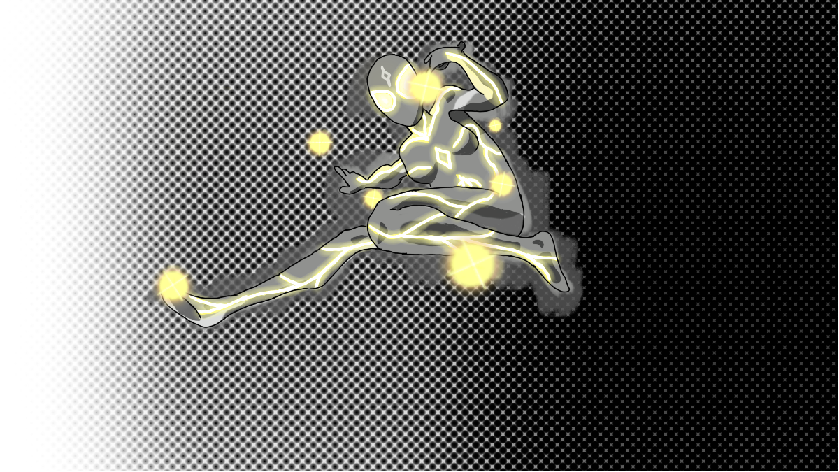
I'm working on a standing pose of this character, and I am unhappy with the suit design in general. Does anyone have any ideas what I should change? The only thing I am sure of is that the gray has to go (at least most of it).
Almost finished art. I have been practicing anatomy and used an image as a reference for this.

comments
Highlighted comment
i like the glowing yellow, definitely keep that if you like it as well! generally chests don’t cast a super hard shadow though; it is usually a very weak and light shadow. maybe adding some safety guards/physical augments like spikes or plating to help break stuff, depending on the character’s abilities and weaknesses
Thanks :3
good art good art