View all
Parent

 See more replies
comments
Highlighted comment
thanks for the tip, my brain just thinks “thin font = good”
yeah, i couldn't figure out a way to do that at the time but i can try
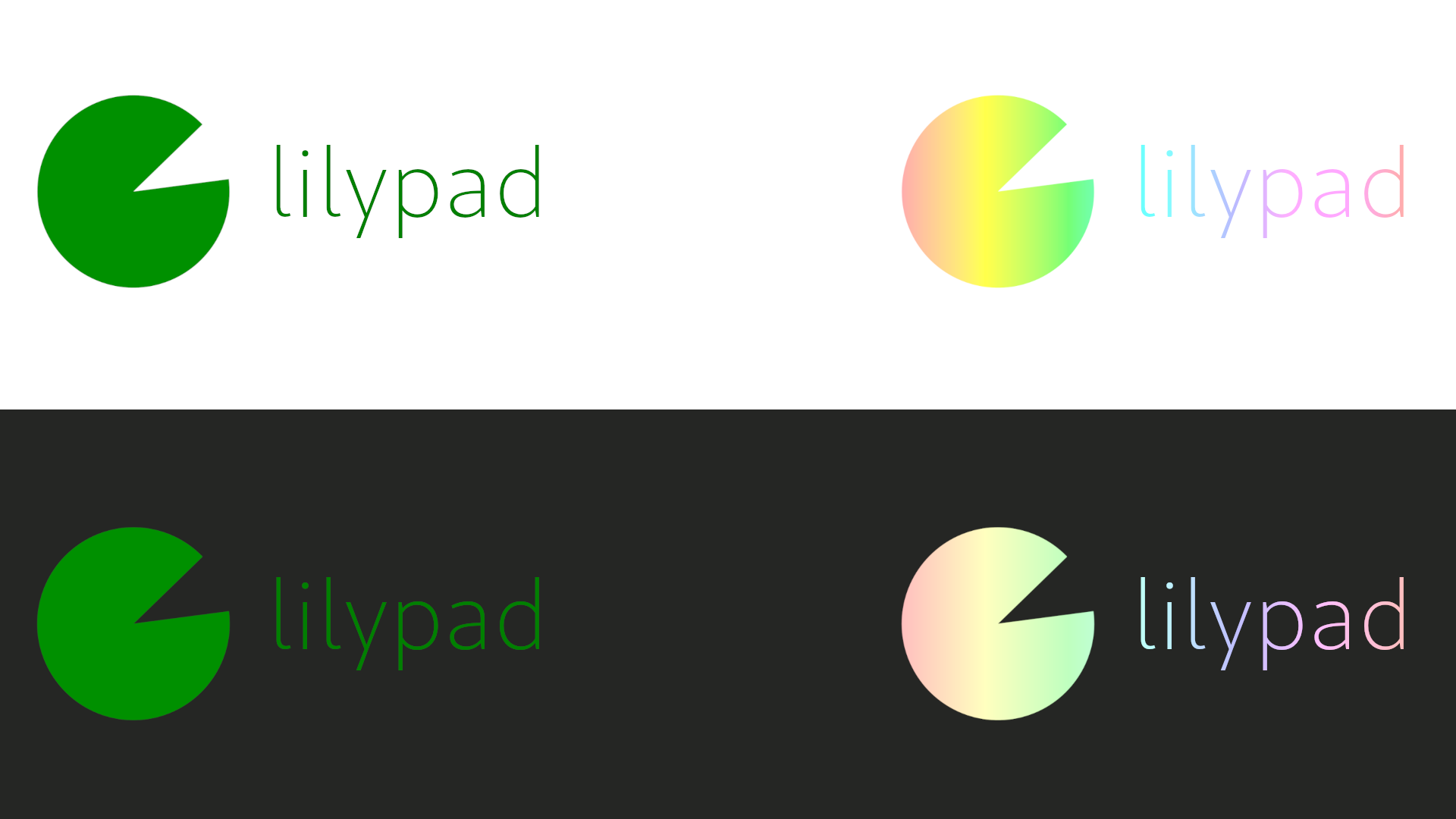
no worries, you could try solid colours instead? they’re easier to work with and allow you to make it work on both light and dark backgrounds more consistently!

da-ta branding?? 
i can’t help myself 

woah those look great!!! :3
thank you so much
Not a problem! If you’d like the SVG files and whatnot then lmk :)
yes please! that would be great
