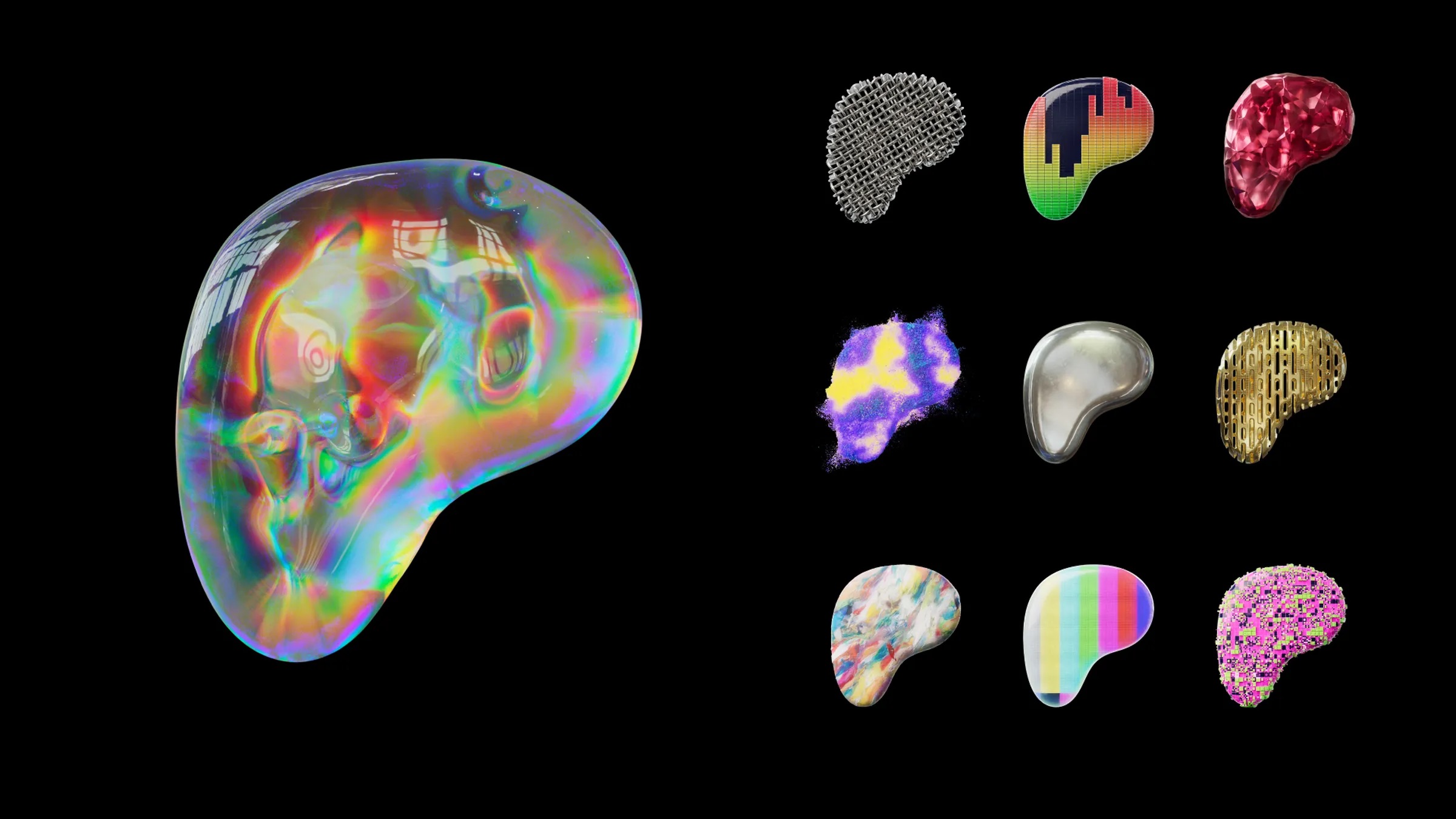
It’s almost impressive how Patreon has consistently been able to make their branding more and more generic, abstract and lacking in personality with each rebrand lmao

comments
they’re gonna use it in a bunch of ways:

They’re kind of deemphasizing their logo, but focusing more on the other parts of their design, like font and style
Slight problem with that: How are you going to put font and style into a simple icon, e.g. when a “Support me on Patreon” link is put on a page?
I agree with @mybearworld but also wanna mention a few other things - regardless of how much you try to not use a logo as part of a branding it is still the most important element, it will be the thing people see on your app icon, the favicon of your website, the icon people use use on external sites to link to you etc. it's vital you get it right regardless even if it won't be used outside of those contexts.
Also, lastly while those versions of the logo are more fun, the black and white one will still be the most prominent on the app icon and favicon