comments
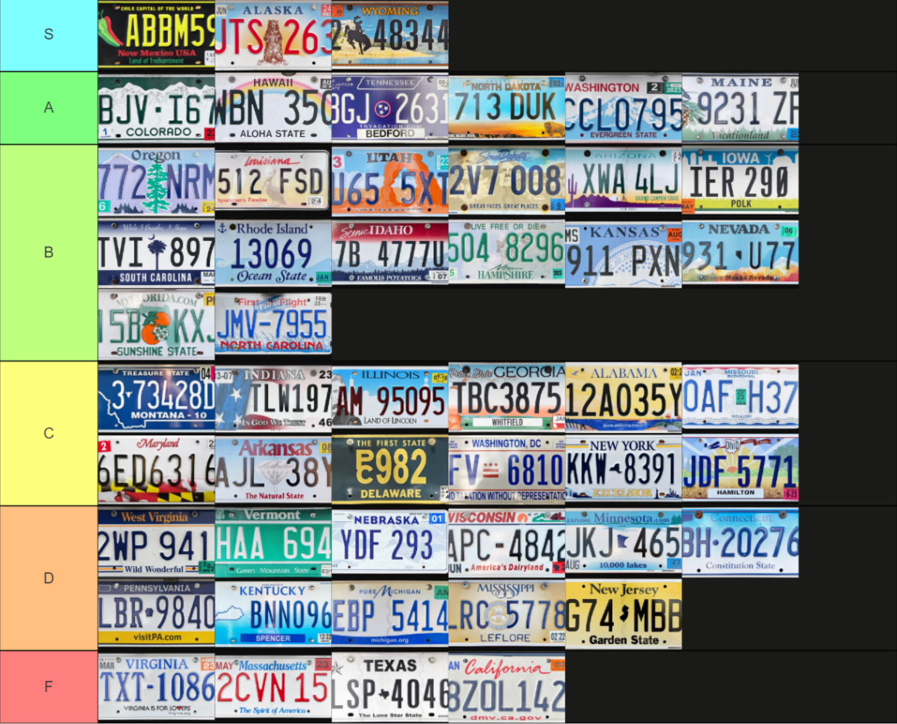
pretty good, although I think Idaho deserves to be an A
The red is too distracting in my opinion, like any other color might have looked better there to me (or none at all), but otherwise it’s pretty good
je me souviens
I’ve lived near interstate 81 (which goes all the way up to ontario eventually) for like 15 years and there are too many quebec drivers on the road smh
Not only are the canadian plates bland in general, that one brings french into my country!
we are invading you in winter
These really all look like they're joke designs to me
I think a lot of these are just the default ones, I didn’t want to deal with one of the larger tier list things that has multiple per state
I work for the company that designed the Tennessee license plate!
I just wrote out a paragraph gushing over license plate design and now I’m realizing how weird that is so I’ll just leave it at they did a good job lol
if you wanna see some awesome concept plates there’s this designer i know from the sports logos forum i’m on and he redesigned the plates of every US state and Canadian province and they’re all excellent, give it a look if you feel so inclined. He’s also got some awesome soccer logo concepts too, super talented guy. https://lysandercaceres.com/license-plates
Alaska, hawaii, and west virginia go hard
lol thank you
as a Massachusetts resident i can confirm our ranking is perfectly justified
I live in Virginia (only reason it ranks higher is cause I personally like the blue and blue instead of blue and red) - that bottom tier definitely needs to rethink their default plates, there’s *so* much wasted potential
absolutely, there’s so much massachusetts iconography we could use and we simply don’t do anything at all. literally the most generic design possible. i suppose one could argue it makes sense to be generic since you want license plates to be clearly visible but you can still balance aesthetics with function here
You saw micahlt’s comment on tennessee but I believe that one does such an excellent job of combining the state symbol and somehow even the state shape without feeling over designed
look, my state is on there!!!! 

tbh I’m scared I let a state in there twice cause I know there were multiple Indianas at one point
i doubt anyone’ll notice if you did ;)
