View all
Parent
comments
Highlighted comment
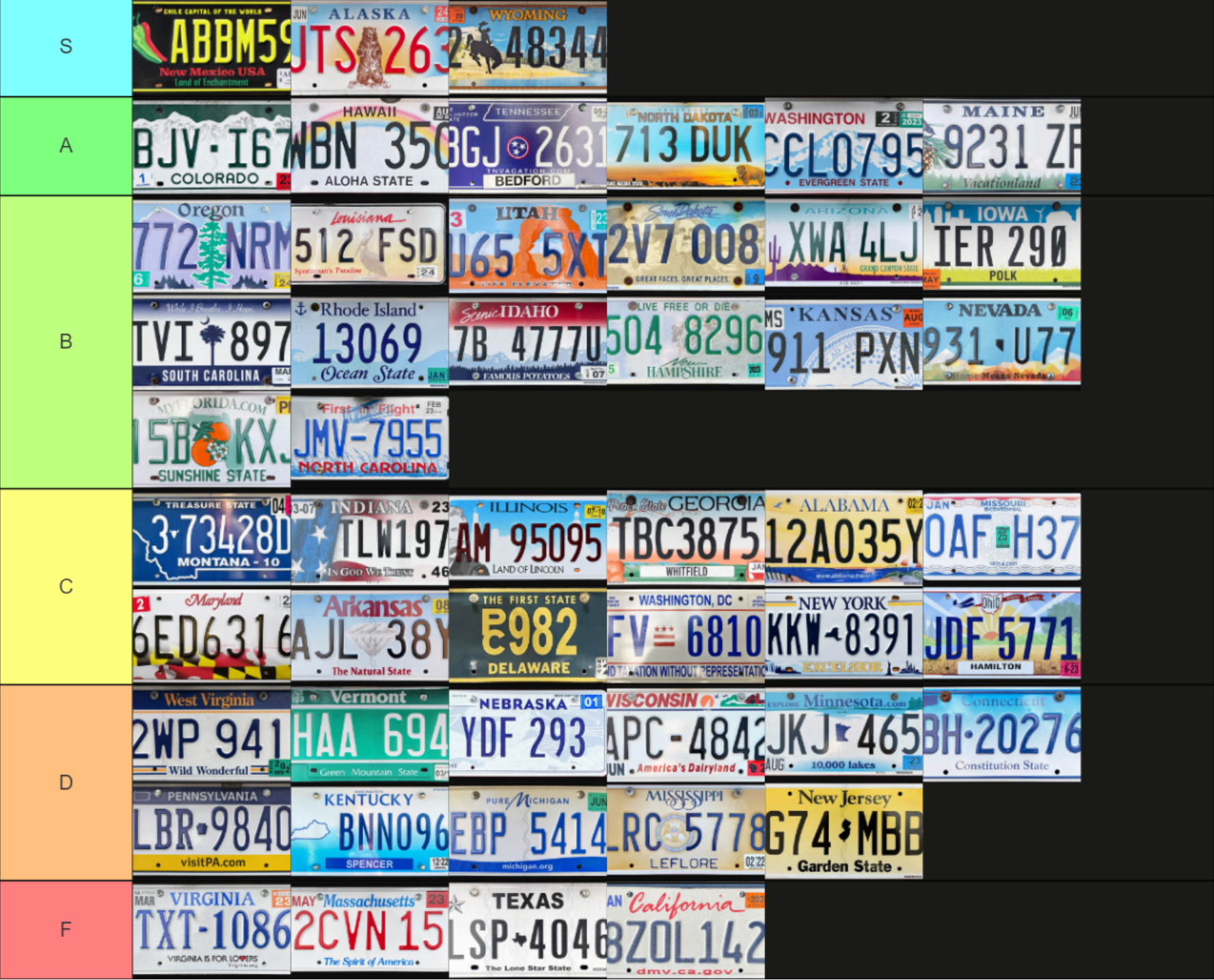
absolutely, there’s so much massachusetts iconography we could use and we simply don’t do anything at all. literally the most generic design possible. i suppose one could argue it makes sense to be generic since you want license plates to be clearly visible but you can still balance aesthetics with function here
You saw micahlt’s comment on tennessee but I believe that one does such an excellent job of combining the state symbol and somehow even the state shape without feeling over designed
